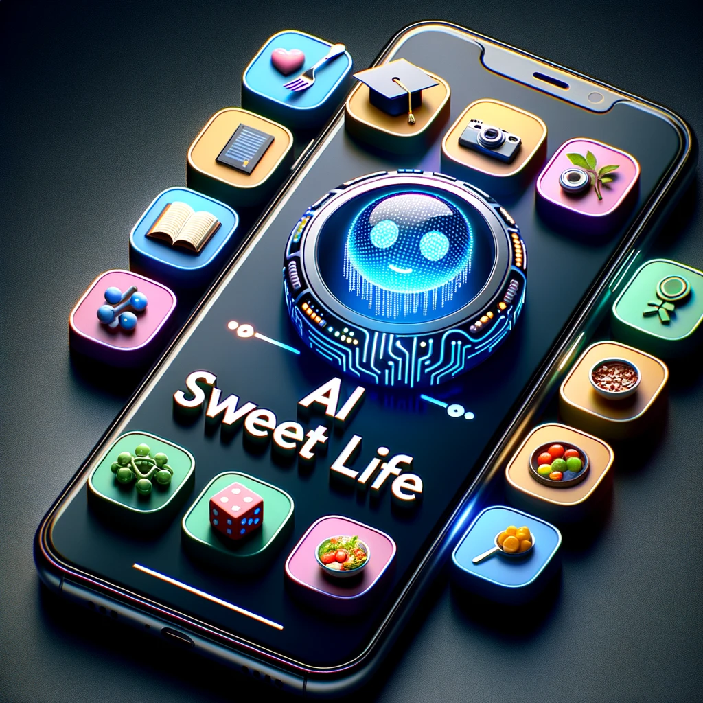
With the power of AI, the phrase “rapid prototyping” is taking on a whole new meaning!
Take the image above, this 3d model and rendering would have taken me weeks to plan and create 10 years ago… heck even 1 year ago it would have been a huge undertaking. My mind is starting to get accustomed to being completely blown every other day in the age of artificial intelligence!!
Now, let’s dig into some logo concepts, courtesy of Dall-e 3…
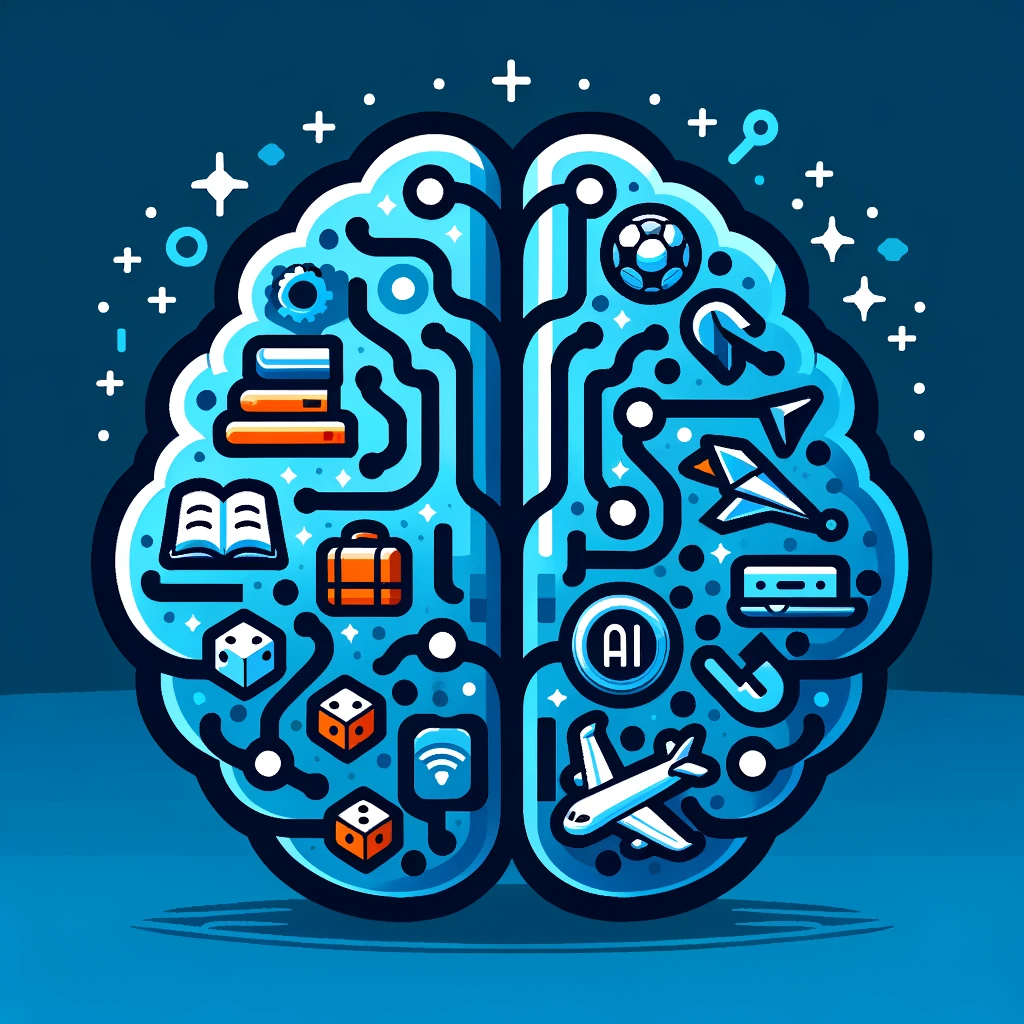
I like it, but it’s too detailed for use as an emblem for this site. What’s next?
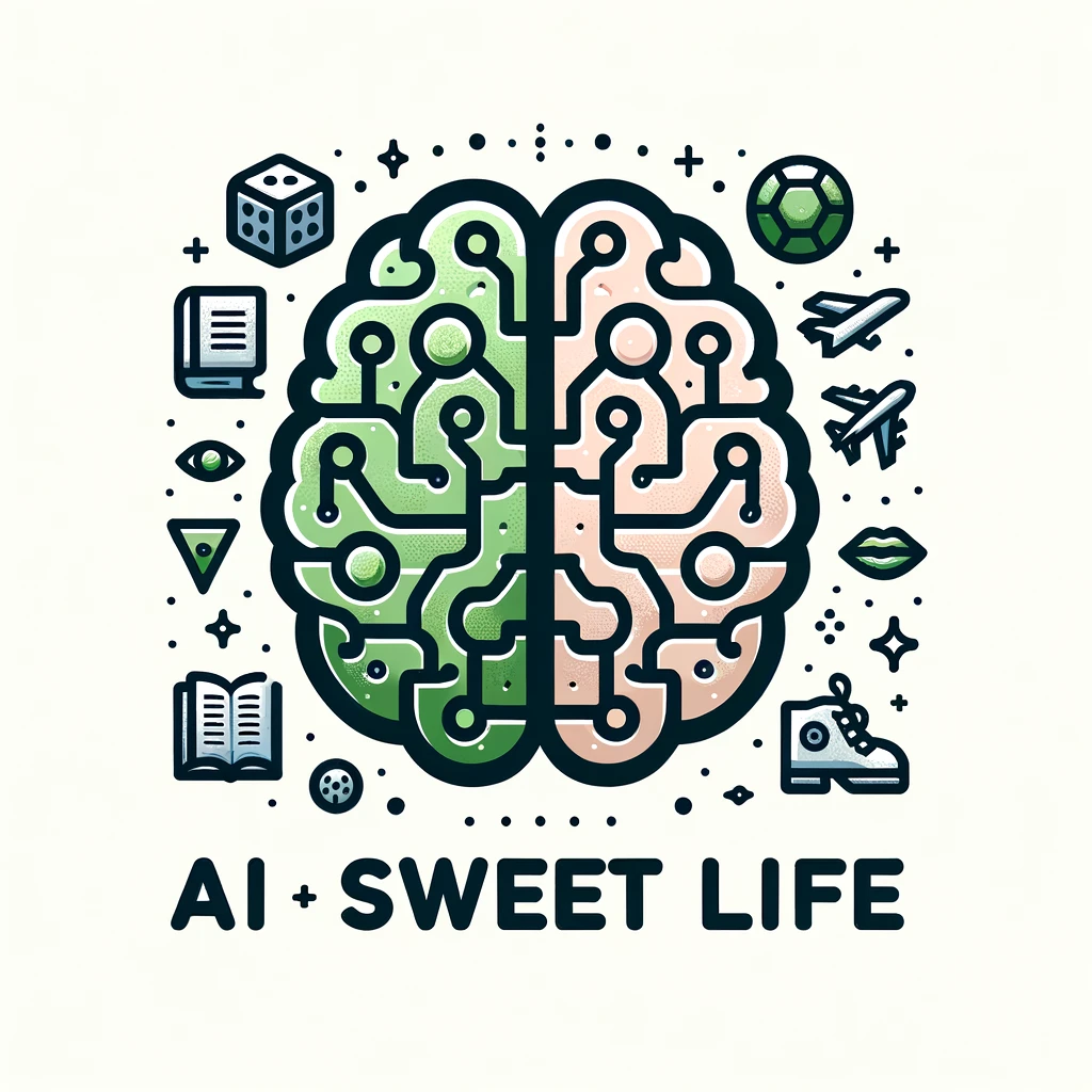
Similarly, this one is just a tad too busy for my liking.
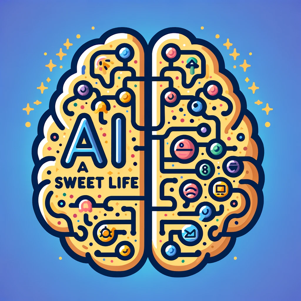
I do appreciate the blue and gold color pallet here, but I’m still interested in reducing the complexity and we’ll need to remove the background.
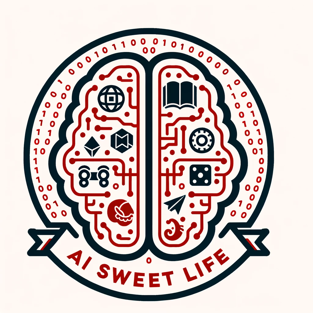
Um…. no!
So, here’s the next instruction I gave to Dall-e 3:
please remix with less detail so the emblem can be used as a favicon!
Let’s see what the magnificent ai has come up with….
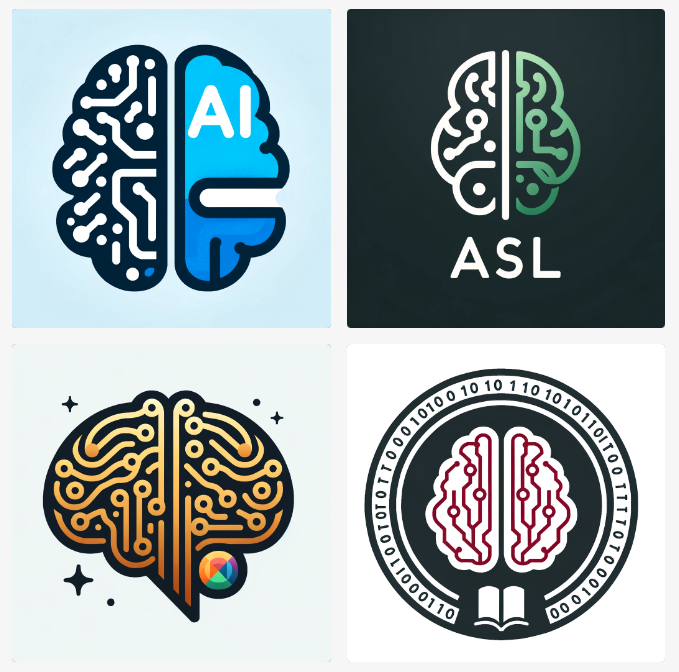
I don’t really care for any of these, so let me work on a more descriptive prompt…
create simplified variations of this logo. half human half digital brain emblem using the blues and gold hues and a white background
and I included a link to the image above with the blue and gold colors
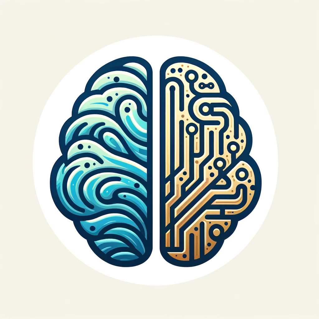
This is certainly getting closer to something usable. I believe that it will need to be simplified further, but I dig the look and feel so far.
One of the cool things about Dall-e 3 is that it will give you a detailed description of every image. Here’s the description it provided for the image above:
Vector Logo: On a white background, a compact brain design split vertically. The left side is depicted with organic, flowing patterns in soft blue hues, representing the human aspect. The right side showcases detailed, geometric digital circuits in a shining gold color, emphasizing the machine or digital aspect.
When I fed that prompt back into it, I received an image that is even more detailed, which is headed in the wrong direction.
Here’s my adjusted prompt:
Vector Emblem: Very simple low detail high impact image. Suitable for a favicon. On a white background, a compact brain design split vertically. The left side is depicted with organic, flowing patterns in soft blue hues, representing the human aspect. The right side showcases detailed, geometric digital circuits in a shining gold color, emphasizing the machine or digital aspect.
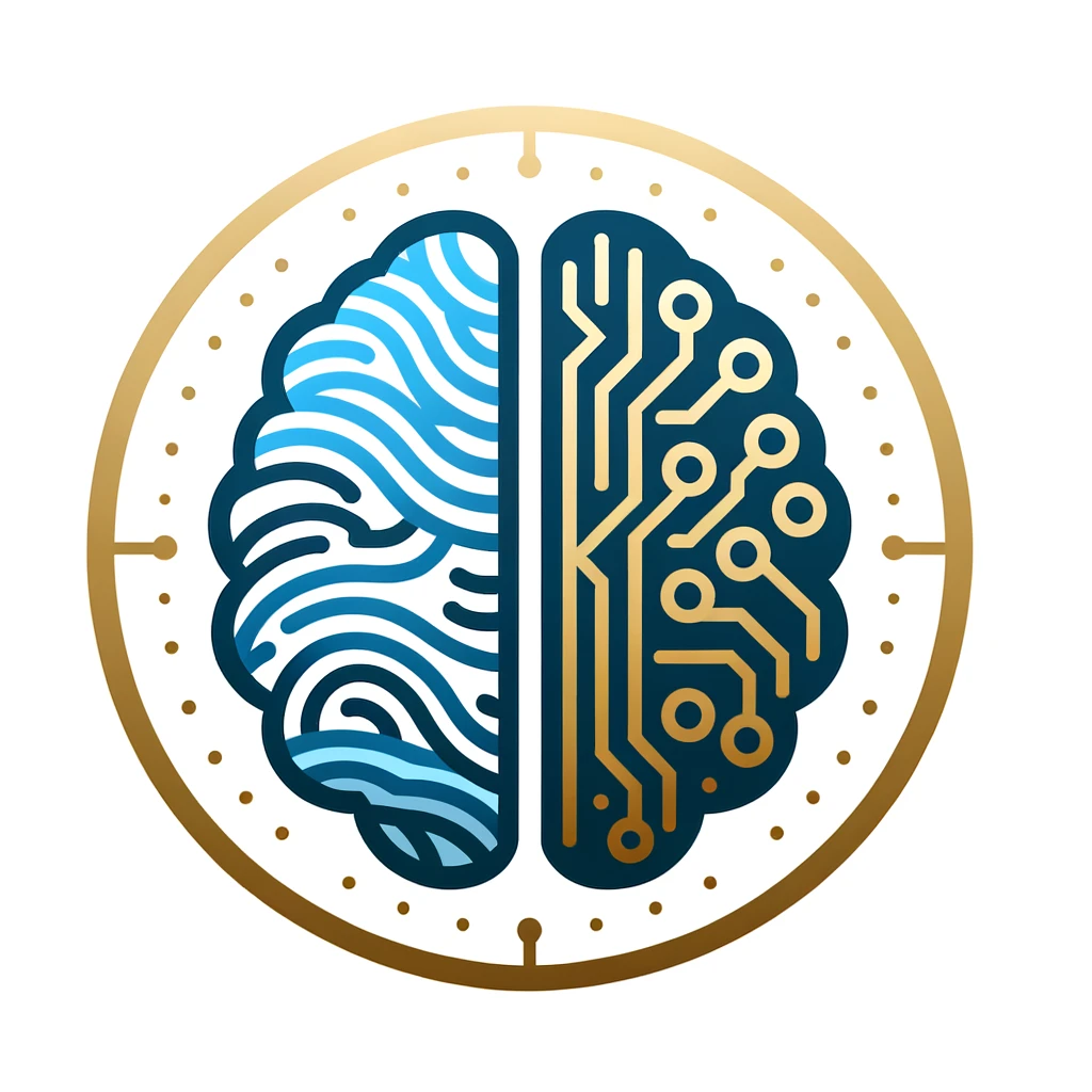
I’m not in love, but we’re headed in the right direction here.
let’s see 4 variations on that emblem with a little less detail
After some back & forth (this is the part of generative ai that nobody wants to show off or talk about), I’m presented with these 4 options.
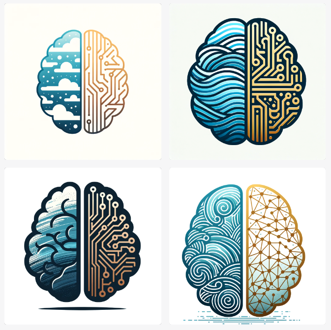
I don’t hate these, but they are still more detailed than I would like. I need my icon to be feasible at a very tiny size on screen.
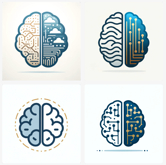
The top two are ok, but neither is worth writing home about. It looks like human logo designers won’t be out of work this week or next, but this is definitely a very effective way to quickly explore logo design concepts!
Side note: I’m very interested to see the advent of generative AI that creates vector images ( as opposed to raster ). For you non-graphic designer types, a vector image is created from shapes while a raster image is made up of pixels. This allows a vector image to be scaled up or down to any size, while a raster image can only be scaled up so large before pixels are visible.
I can take some of these visuals and give ideas to a professional logo designer… But, before I give up on this, let me try changing up the colors. I think the blue may actually be confusing the AI. I’m going to try out pink for the human side and gold for the digital side of the brain…
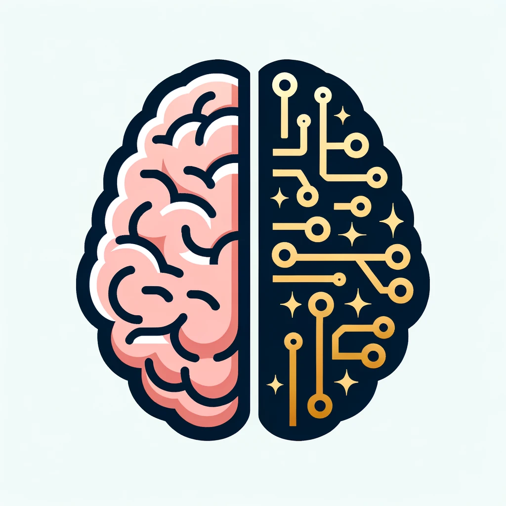
Yes! I think we are now on the right track 😉